April 29, 2010

Evaluation

March 20, 2010
In terms of gaining audience feedback for my final cut of my TV Drama opening, I chose to adopt a more virtual method rather than the orthodox 'paper and pen' method, so to speak. I utilised the website- www.surveymonkey.com - in order to retrieve my audiences responses to both my main task and my ancillaries.

I created a Facebook page in order to show case my work and I invited people within the age range preferred and got them to comment on my work. Subsequently I created a questionnaire via surveymonkey and got them to fill that out as well:


March 18, 2010

Ancillary Progress

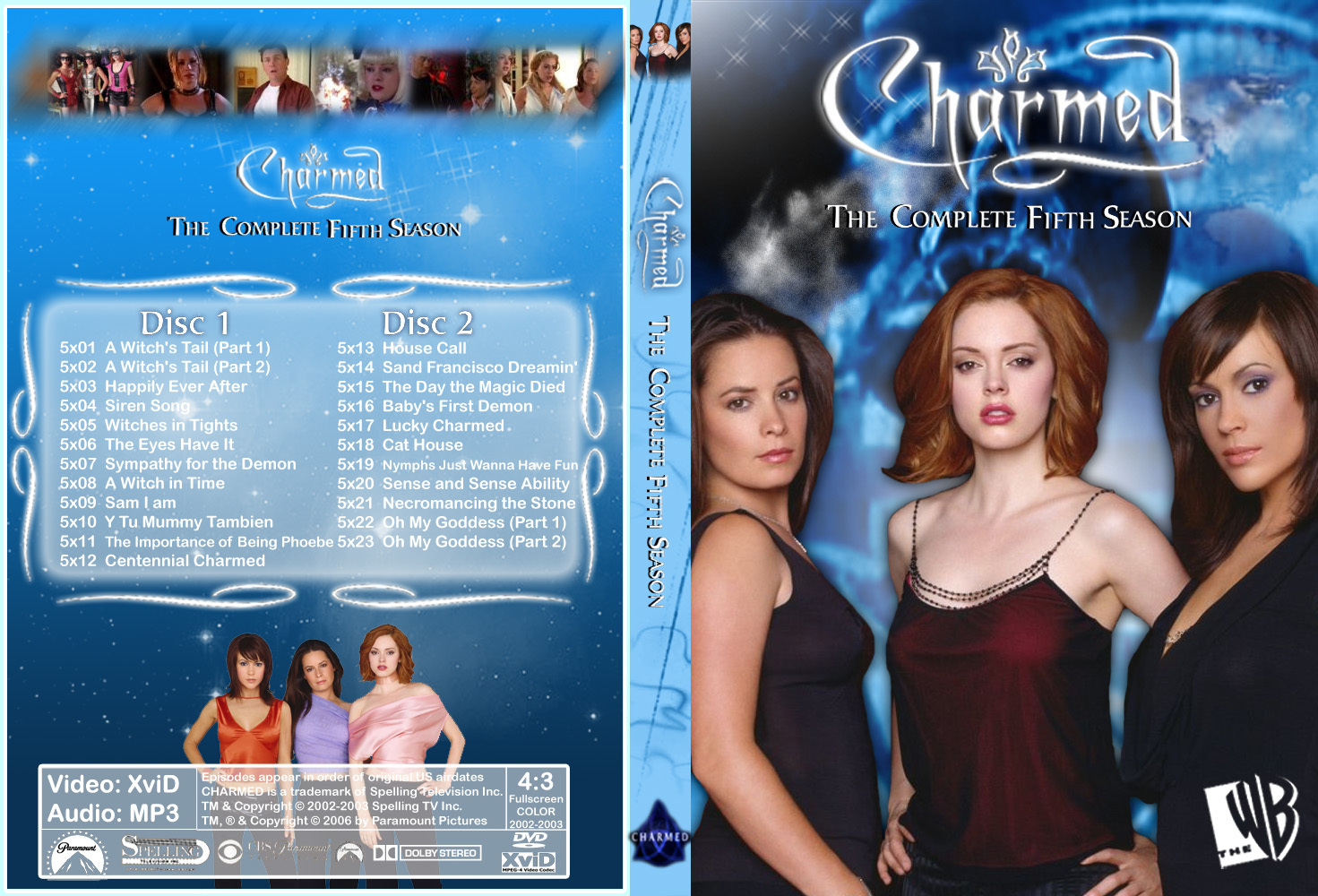
DVD COVER
MAGAZINE COVER


February 13, 2010

Rough Cut- Oracle

Here is the rough cut of my TV Drama Opening:


The critique I had received for this was that the pre-opening sequence didn't have any continuity meaning that none of the events flowed. Therefore, I have planned to include extra shots that would help the continuity of the piece. For the beginning, instead of going straight into the ritual, I have chosen to zoom into a house and then initiate the ritual. Subsequently, the phone call will be preceded by a stalker in order to give it some sense whilst keep the narrative distorted. Then before the city shots I will have an eye in order to reinforce the fact that the main character sees the future. Finally, the Chimera Corp. clip will have jump cuts of the Greek letters Lambda, Chi and Nu, whilst having a part where a character is writing down the symbols and the possible connotations of them. This I believe should bring the pre- title sequence to a definitive close and establish an understandable yet distorted narrative.
February 06, 2010
Magazine Cover

As my target audience is that of females aged 16-25 therefore, I have chosen to aim for the younger end of my audience whilst targeting the age range in general as I feel it will be easier for me to produce a product that will relate to the potential younger readers.

I have chosen for the masthead to take up the top half of the page so that it will be dominant and therefore easily recognisable for my audience. I have also decided to have 'magazine' written underneath to reinforce the idea of the magazine and so that the reader does not mistake it for another magazine. This was also evident in the Doctor Who magazine cover, as they have also placed the word 'magazine' under the masthead.

Regarding the female audience, I have chosen to incorporate some conventions of stereotypical associations to this gender such as fashion, beauty and relationship problems. Furthermore, other articles to help reinforce that this is a TV Drama Magazine are those relative to the shows content. I have chosen to articles associated with university life and horoscopes. in addition to this, I have also included an episode time line to give the magazine a complete referral back to the TV show. This means that whilst the audience is being provided general enticements they are being bought back to the show at all times.

I have also included a competition as a teaser so that the reader is drawn into the context of the magazine and are tempted to purchase it. I have chosen to relate the competition back to my female audience and provide them with a 'luxury shopping spree'. The word 'luxury' acts as a teaser that helps draw the audience in to the magazine.

My choice of image was to have a long shot of a girl blowing her hair upwards to provide a sense of boredom and idle. thus making it relative to the audience once again, however i feel that i may have to change this later on and then try and make it more engaging with a possibly more up beat expression and add to the appeal of the magazine.

So far I have come to a conclusion of having red and black as the main colour scheme for the magazine. I feel that these two colours are dominating and will give the magazine a sort of formality therefore, appealing to my audience.


- - - - - - - - - - - - - - - - - - -


DVD Cover

I chose to go for a sectioned front cover with 3 of the main characters. This would notify the audience that this season would have been predominantly about them. The body language for each of the characters will have hinted their nature within the show and i chose for the two females to have a slightly arrogant and reserved posture and the male character to have a nonchalant posture to the dominance of the female characters over the male character. This will also draw reference back to my target audience whom are mature females.

I chose for the main title to be placed at the bottom right so that it will be the last thing that the audience will see. It will be in a sans serif font to provide an informality to the cover drawing back on the ages of the main characters.

For the back cover I chose to have the main title placed at the top to reinforce the shows name. Then I would have the blurb, in which a general overview of the show would be provided and this way that the audience will understand the content of the show. Underneath, following the codes and conventions, I have chosen to include stills of the show so that the audience gets a visual stimulus of what the shows content will be like. I will then have a group shot at the bottom to reinforce the main characters of the show so the audience is reminded and won' t be new to any characters.

The colour scheme for the DVD cover I felt would be a more inviting and appealing palette. I felt that white and red would go well together in contrast to the magazine palette which is red and black. The white would provide a sense of positivity for the audience. The red I feel acts as a more dominant position thus drawing the audience's eyes towards the main title on the cover.
These are the main commonalities that are present within the TV Drama magazines I have reserached:

>> The Masthead will always be the first thing that the audience sees. There is the exception that an image bleeds onto the masthead showing it has been established for a long time.

>> The central image is relative to the magazine as well as the shows nature. Also, it comply's with the colour scheme of the magazine in order to draw the audience attention.

>> All minor articles or coverlines are positioned to one side of the cover to show their insignificance.

>> The text is mainly sans serif for a younger audience, this way the magazine seems more inviting.

>> The main article takes up most of the front cover in order to make the reader jump to that article.

>> All insignificant information or the plugs are positioned out of sight but are still visible enough so that the reader is still informed of things such as the date, price or issue number.


January 27, 2010

Magazine Covers Analysis


January 26, 2010

DVD Cover- Conclusion

Having researched 3 DVD covers that are relative to my specified genre of TV Drama I found that these are the most key factors:
  • Main character(s) are framed central and predominantly at a MS.
  • Strict colour palette, mainly blues and whites.
  • The back cover offers snippets of the show with pictures of all the co-stars.
  • There is often a blurb describing the show's content.
  • The episodes are stated in the middle of the back cover.
  • There is also a strict font regime: If the title is in a Serif font, then it will remain serif on the back.
  • Main title is placed at the top of the cover.
  • The front cover slightly hints out the narrative of the show.

January 24, 2010


January 12, 2010

Royalty Free Footage

WEBSITE

In my animatic there is shot of a city and a destroyed city, I originally used photo stills and imposed camera zooming effects in Adobe Premiere Pro in order to give it some animated features. However, I was informed by a class mate that the photo stills did not provide the same effect and detracted from the continuity of the opening. This is when i considered the possibility of there being copyright free footage, and there was !! The website above provided a vast array of city footage and for that I am entirely grateful for this website.
January 10, 2010

Filming shoot.- 8/1/10

Friday 8th January 2010

Today I covered all the shots required, this was the tracking for the ritual, the mobile phone, and the internet shot. I did this with some efficiency after practice shooting with random objects. For example, for tracking, I practised with the stairs and found a way to comfortably hold the camera in order to create a smooth tracking line.

The difficulties that lied ahead were that of lighting, excessive noise, controlling the actors and fidgety camera work. In order to take care of the lighting I used several lamps in order to create a dim glow so that the characters were distinguishable from the background. In addition to the artificial lighting, I also used candles to highlight the main character within the ritual scene. In terms of excessive noise I meant background noise. There was too much graininess when trying to record the mobile phones ring tone, not only the ring tone but also the speech that was required for the ritual scene. This was overcome by me having searched for a set of headphones that had a microphone attached to them. Then I downloaded a sound manipulating programme called Audacity, which allowed me to remove the excessive noise having re-recorded the dialogue and ring tone. Controlling the actors was a very difficult process as the actress had not learnt her lines for the ritual scene. In addition to this, the extras in front wouldn't stop laughing therefore, lengthening out the process which aggravated me. Thus in time, and after several rehearsals the actresses finally calmed down and did the scene with ease and proficiency which made my workload easier. Lastly, the fidgety camera work occurred when trying to track across the extras. Having done some practice shots with which I began to understand how to hold the camera and tripod and how to frame the scene, I never accounted for the space that would have been taken up by the extras. This is when my camera work became fidgety. I had deliberated how to set up the frame and I had decided to not make the extras too spaced apart and to keep the main actress on her knees so that there was not too much height between the two sets of characters. Having done this, I was able to track along the actresses with ease, but I still feel that it could have been better as the camera shifts slightly. I had attempted to find various way of attempting the tracking process. I tried a wooden plank on a skateboard in order to keep it perfectly still, however the skateboard was rumbling on the ground. I then tied the camera carefully on to a scooter, which i had high hopes for, but the angle wasn't correct. In the end I resorted to a hand held format. I felt this was appropriate because it added a sense of distortion to the scene which worked well.

Having had no previous experience with a camera in my AS coursework, I felt that this was a big accomplishment.I had gained some filming experience in my previous idea- Fangs. The camera work I had undertaken at that time had helped me a lot in my attempt to film for this piece. For example the tracking through the woods was hard due to the fact I had to multi task meaning that I had to film, frame the shot and look where I was going all at the same time. Luckily the shot prevailed exceptionally and I was able to use that experience but apply to a much slower and controlled pace rather than at a frantic pace so that the audience could absorb the scene's content.


November 08, 2009

New Animatic- Oracle

Due to the poor microphone quality on my computer, I deviated from adding diagetic sounds and instead put in the scripting for the opening of my drama. I have made the opening to seem as if the show has been going on for quite some time, therefore I will be able to construct a more trailer like opening which will grab the audiences attention quickly. My target audience is women aged between 11-20
therefore, I chose to enter the mature teen drama segment, targeting the ages of 16-20 year old women.

ORACLE ANIMATIC-

November 02, 2009
Today during my Integrated Learning Project in media, I began to re-construct my rough cut and officially changed it. I was given some hindsight into what TV shows I should be looking at and this set me off on my tangent. My target market is ranged between 11-20. Thus I intend on focusing on the mature teen dramas that are potentially for people aged 16-20 and they are:

LOST-


The camera work mainly uses Long Shots and Close ups of the characters and the landscape, in which they have incorporated pans in order to give the audience a full view of the locations, thus allowing them to settle into the show and become familiar with the context. There are a few action shots in which explosions and other events are taking place, this further allows the audience to come into full recognition of what the narrative will be like. The editing predominantly uses crossfades in order to provide some coherency to the opening and suggests everything is connected. In addition the pace is very slow and is in synch with the soundtrack upon which invokes tension and dramatisation within the title sequence. The mise-en-scene shows island scenery, rugged clothes, distraught people, thus reinforcing the title of the programme 'Lost'.


Heroes-


The initial zoom out of the world connotes that the show takes place globally. The main shot selection is that of a Close up in order to keep the audience engaged with the main character of the show. There is a track outwards and around the character to show his surroundings, being a city building rooftop. In order to reinforces this, the director has chosen a birds eye shot and a worms eye shot in order to show the height of the building in comparison to the one man in the area. The editing is again slow paced in order to stay in synch with the eerie soundtrack and the voice over.

Charmed-


A birds eye of three girls around a book begins to depict a sort of ritual occurrence thus informing the audience of the shows content. The camera has chosen to do location shots of San Francisco in order to allow the audience to understand that this is where the show is established. Throughout the title sequence the audience is given close ups of the main characters in order to familiarise themselves. Furthermore, there are plenty of action shots which in turn are aided by rapid succession in the editing. There are flashes and cross fades which help to give the title sequence an ethereal feeling. This is reinforced by the mise-en-scene with various cultural signifiers such as candles, the trinity sign, wiccan symbols and ritualistic apparel all help establish that the main characters have some relativity to magic.

True Blood-


The cinematography in this opening is very amateurish as it is hand-held to give the effect of it being someone's journey. The predominant shot choice was that of close ups and long shots of various locations. There are pans and tracks of various scenery to help the audience settle into the atmosphere. Places such as the church, swamps and bars help the audience to identify what the narrative will entail. The editing is once again synchronised with the soundtrack, with it being slow paced western folk music with an eerie twist. The editing also includes rapid successions at points in order to distort the viewer. This leads on to the mise-en-scene which is all relative to the western folk lifestyle, there are images of sex, alcohol, bar fights, black community. Furthermore, there is a binary opposition with the religous depictions and the sexual orientation which further helps to establish the narrative and the realism of the text.
November 01, 2009

Rough Finished

Rough Cut Complete

NB- YOUTUBE HAS CUT OUT SHOT 1!


FEEDBACK:

Having shown this to my teacher I obtained feedback describing that my TV Drama opening was too trailer-esque. This was due to the lack of continuity throughout my opening. There was the predominance of the male character, however, near the ending before the official titles, the audience was oblivious to the other 3 characters that were shown therefore I am considering to re-do the shooting and the animatic. I want to make my opening similar to that of "The Worst Witch" and "Young Dracula". This is because it is the sort of genre i wish to embody in my TV drama opening. Furthermore, it was said that the music was too theatrical and this added to the trailer like appearance of my opening.

In order to tackle these concepts, i will make my opening shorter and include a more jingle-y type of soundtrack that simutaneously engages the audience too. This should make the opening more effective for my audience. However, i am considering whether i should do it via live action or animated. Live action would make the opeining more realtive, whereas, animation will detract from that aspect and give it a more comical appearence.
October 26, 2009

Fourth Filming Shoot

26th October 2009

Today was a challenge. I shot all the shots of the main character and the key locations at the beginnning. Regarding shot no.5 on the storyboard, instead of having the character coming out of the ground, he proposed an easier method which was him falling out of a tree. This provided the same effect and saved a lot more time. This turned out to be more effective.

For shots no.2+3 i have decided to utilise a handheld camera in order to distort the viewer and help follow along with the tempo of the soundtrack.

For the running scene (shot9), i found the method of handheld tracking to be highly challenging. This was obviously due to the clarity of the motion. This took a while to establish, yet i am still not satisfied with it as the clarity is ok but i was hoping that the tracking would have gone smoother.